Signage designed to be recognized, not read.
In healthcare, every second matters.
Healthcare workers often move quickly between patients, departments and responsibilities. Existing infection control signage had become easy to overlook, making it difficult to recognize the level of risk and follow the correct precautions before entering a patient's room. The goal wasn't simply to communicate information. It was to communicate it instantly.
Good information design isn't read. It's recognized.
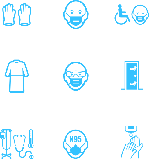
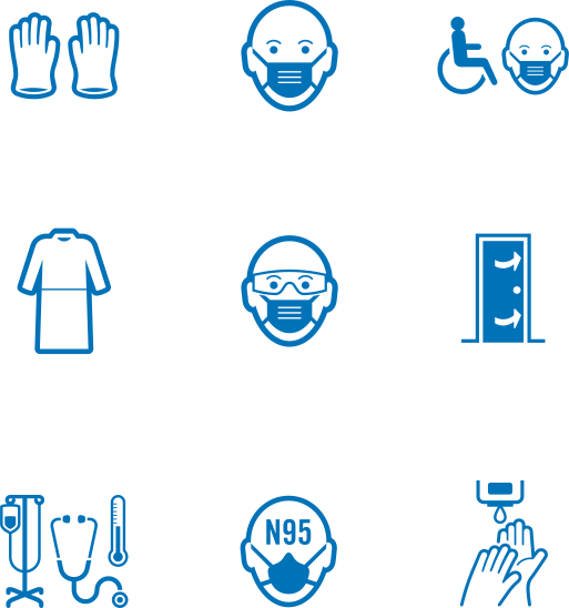
Idea Studio developed a standardized visual language that helped healthcare workers identify transmission risks at a glance. Through consistent iconography, colour coding, typography and layout, complex infection control procedures became easier to recognize, understand and remember across hospitals and long-term care facilities.
Rather than relying on dense instructional posters, the system was designed to support fast decision making during the moments when it mattered most.
Cut to the shape of a caution triangle, the door signs read at a glance.
Each is colour-coded to the type of transmission, contact, droplet, droplet and contact, or airborne, so the right precautions register before anyone reaches the door.


Where more instruction is needed, the system scales to an 11 by 17 poster.
The same colour coding carries over, now built around a stop octagon with room for the complete precaution sequence.


The system follows the worker past the door.
Donning and doffing sequences and a direct-care reference, sized for a lanyard and colour-matched to the signs on the wall.


The system reached past the wall and into the curriculum.
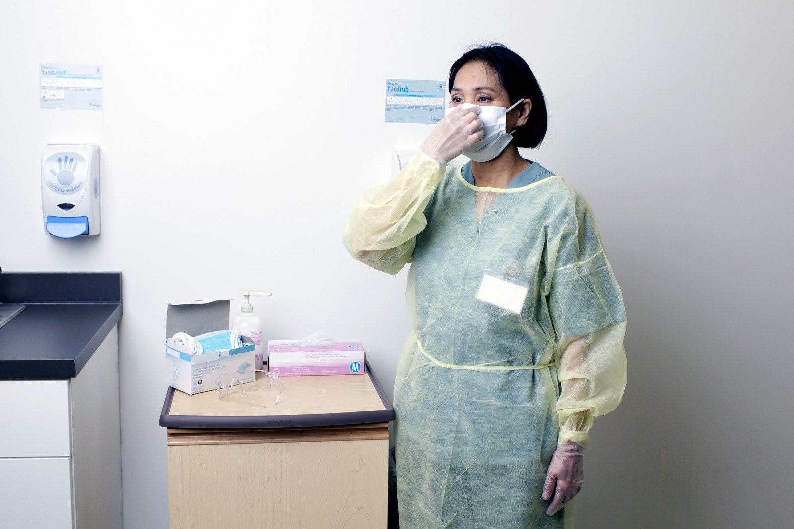
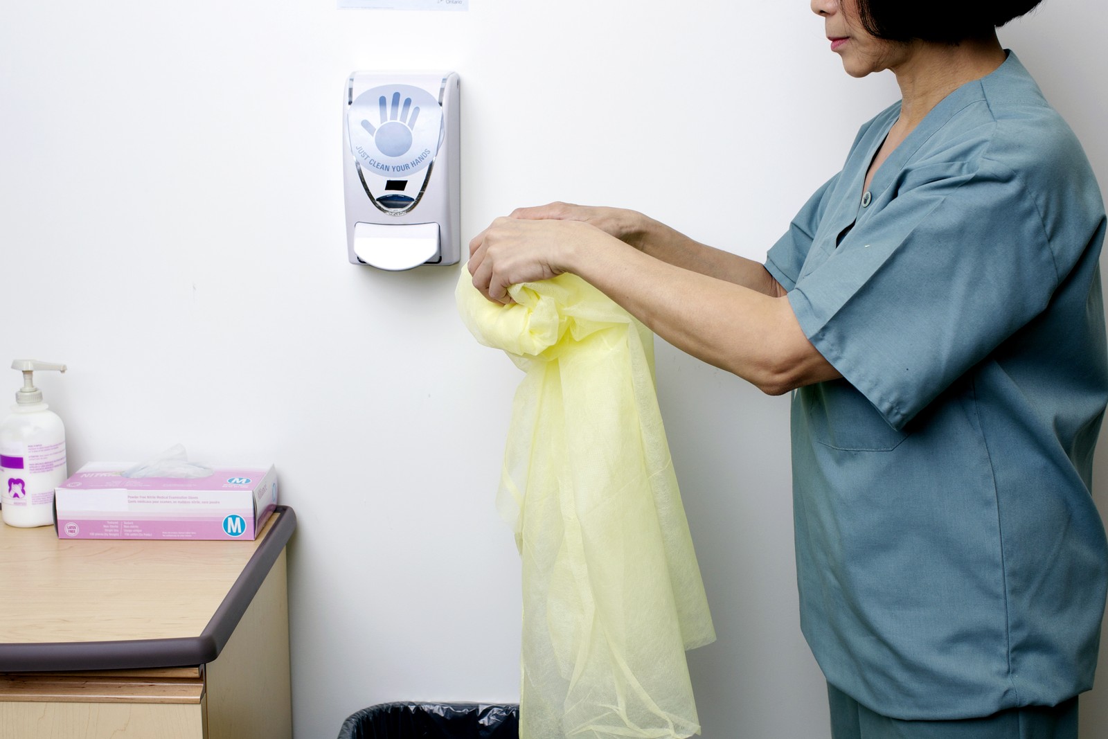
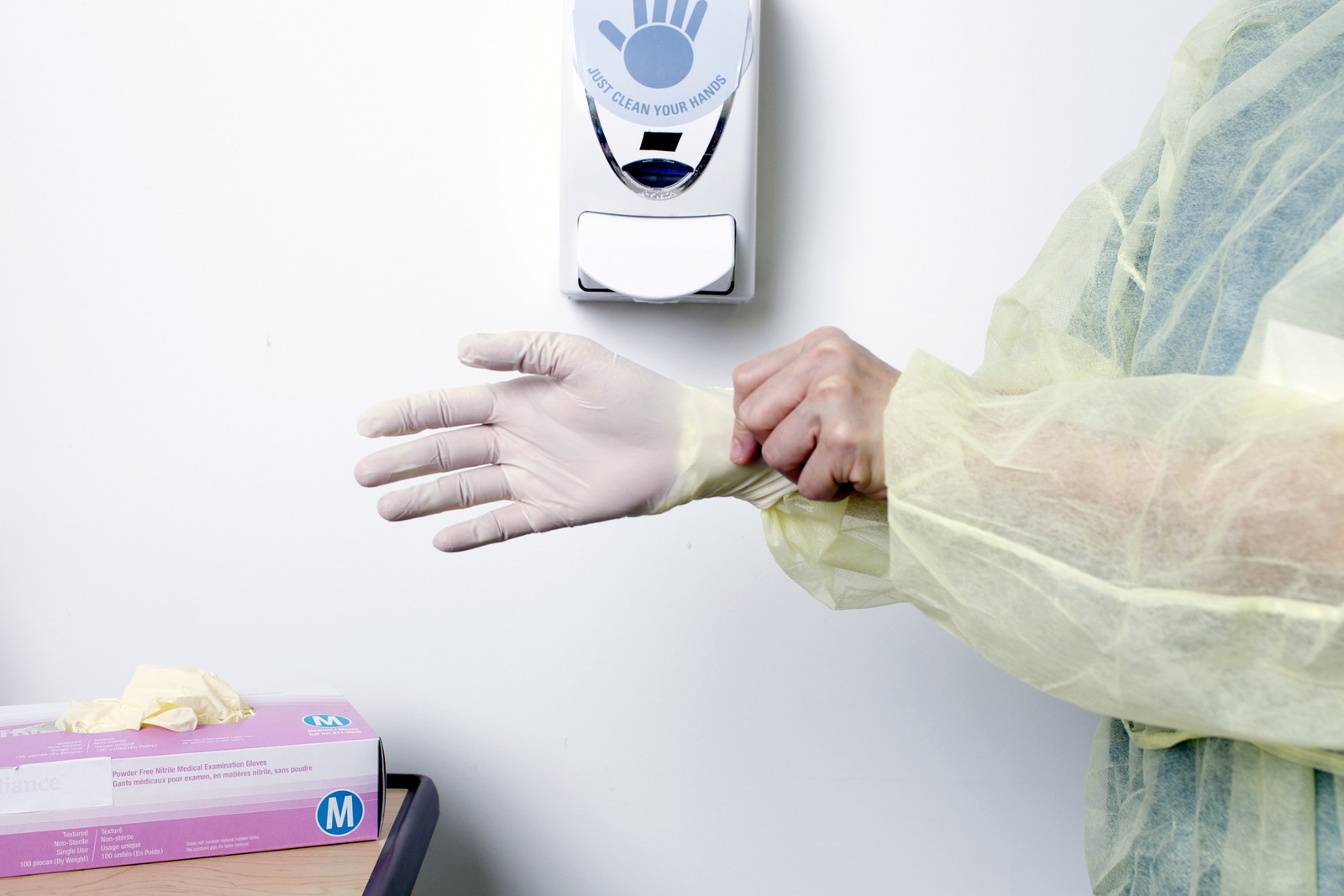
Idea Studio also produced two eLearning training modules and a companion image library for Public Health Ontario, teaching healthcare workers across the province how to don and doff protective equipment and follow everyday infection-control practice. It was a full production, shot over several days with a film crew. These photographs are a small sample from the library.

The objective wasn't simply to improve signage.
It was to create a visual language that healthcare workers could recognize almost without thinking. By reducing cognitive effort and increasing clarity, the system helped support safer decisions in environments where attention is constantly divided and every moment counts.
Iconography by Jason Munger.