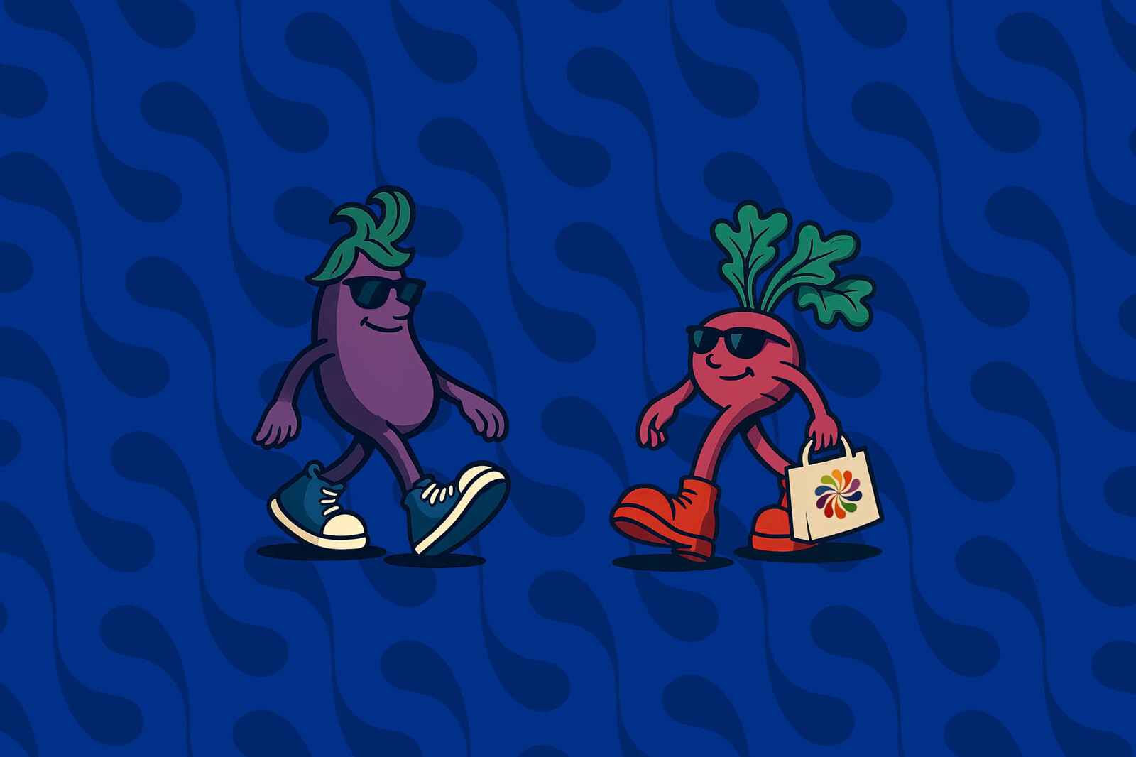
Taste becomes connection.
Many conversations about food begin with problems.
Climate change. Nutrition. Food insecurity. Regenerative agriculture. They're all important, but they ask people to care before they've had a reason to connect.
Working with the Canadian Centre for Food & Ecology, we explored a different question.
What if flavour could become the first step toward something much bigger?
Connection begins with a single bite.
Flavour Harvest was created as the public-facing expression of the Canadian Centre for Food & Ecology: a brand designed to reconnect people with food, place and one another through shared experiences.
The journey begins with flavour because taste is universal. A fresh tomato. A warm carrot pulled from the ground. A meal shared around a table. Those moments create curiosity, conversation and community, opening the door to deeper discussions about living soil, local agriculture and healthier food systems.
“A taste-first experience designed to connect people to food, to place, and to each other.”
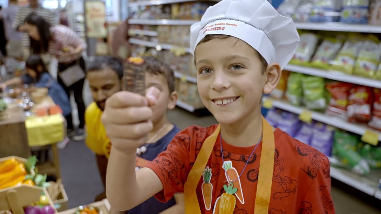
The identity celebrates abundance, diversity and joy.
The symbol combines seeds, sunshine and tasting tongues into a vibrant mark that feels alive with movement and possibility. Colours are drawn directly from fresh produce, while the typography brings warmth and personality without sacrificing clarity. Every element reinforces the idea that food is something to experience and share, not simply consume.
The system was designed to adapt naturally across farmers' markets, fundraising dinners, educational programs, merchandise and digital experiences, while remaining instantly recognizable.
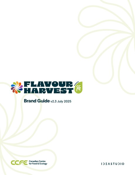
The guide links directly to every logo, ready to use as RGB (SVG) for screen and print-ready CMYK (AI) for production.
Flavour Harvest wasn't created to promote a single event or initiative.
It was designed as a platform that could grow alongside a movement dedicated to healthier people, healthier communities and healthier ecosystems.
Because when food becomes something we experience together, it becomes more than nourishment.
It becomes a social good.